Principles of effective data visualization (using R)
Some basic principles
Taken from various sources (see resources below)
- Show the (raw) data (e.g. individual data points)
- Minimize ‘ink’ and maximize ‘data’
- Keep the graph as simple as is appropriate
- Make graph as self-explanatory as possible
- Emphasize comparisons between values and groups (e.g. same unit)
- Use ‘small multiples’ graphs to show differences between groups
- Pay attention to the meaning of the colour scheme (e.g. see ColorBrewer)
- And think of colour blind people!
- Focus on the story the data is telling
Things to avoid:
- Avoid bar plots: they hide the real data and distort the reality of the data
- (unless the data is proportions/percents)
- Avoid SEM as error bars: isn’t a good measure of spread
- (use SD or interquartile range instead)
- Avoid pie charts: can easily unintentionally distort the data
- (use bar charts with groups side by side)
- Avoid 3D charts: they visually distort the data
- (sometimes 3D is needed e.g. with geography)
Resources
Code
fake_data <- data.frame(
    Group = as.factor(c(rep('Treatment', 10), rep('Control', 10))),
    Weight = c(rnorm(10, mean = 50, sd = 4), rnorm(10, mean = 60, sd = 5))
)

library(dplyr)
#>
#> Attaching package: 'dplyr'#> The following objects are masked from 'package:stats':
#>
#> filter, lag#> The following objects are masked from 'package:base':
#>
#> intersect, setdiff, setequal, unionsummary_fake <- fake_data %>%
group_by(Group) %>%
summarize(mean = mean(Weight),
se = sqrt(var(Weight) / length(Weight)))
library(ggplot2)
p1 <- ggplot(fake_data, aes(y = Weight, x = Group)) +
geom_boxplot()
p2 <- ggplot(fake_data, aes(y = Weight, x = Group)) +
geom_jitter(width = 0.25)
p3 <- ggplot(summary_fake, aes(y = mean, x = Group)) +
geom_bar(stat = 'identity', width = 0.5)
p4 <- ggplot(summary_fake, aes(y = mean, x = Group)) +
geom_bar(stat = 'identity', width = 0.5) +
geom_errorbar(aes(ymax = mean + se, ymin = mean - se), width = 0.25)
library(gridExtra)#>
#> Attaching package: 'gridExtra'#> The following object is masked from 'package:dplyr':
#>
#> combinegrid.arrange(p1, p2, p3, p4, ncol = 2)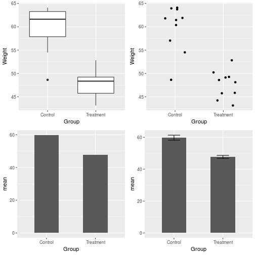
library(ggthemes)
ggplot(fake_data, aes(y = Weight, x = Group)) +
    geom_jitter(width = 0.25) +
    geom_errorbar(stat = 'summary', fun.y = 'mean', width = 0.6,
                  aes(ymax = ..y.., ymin = ..y..)) +
    theme_tufte(base_family = 'sans')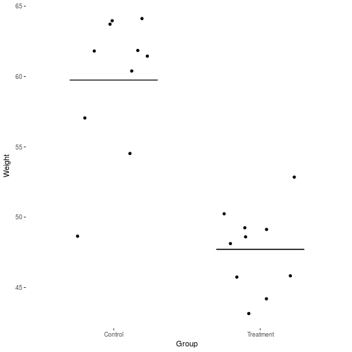
ggplot(iris, aes(y = Petal.Length, x = Petal.Width)) +
    geom_point() +
    facet_grid(~ Species, ) +
    theme_tufte(base_family = 'sans') +
    theme(panel.spacing = unit(2.5, 'lines'))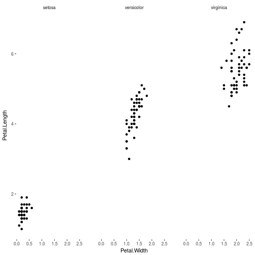
Written on March 1, 2017