Data visualization in R using ggplot2
R has a beautiful set of plotting capabilities that allow it to produce publication-quality graphs very easily and quickly. A commonly used package for making graphs in R is called ggplot2. This “Grammar of Graphics” package (hence ‘gg’) has become very popular beacuse it has great documentation, tutorials, and cheatsheets (see the Resources links on the bottom), in addition to it being fairly easy to learn and use.
So let’s get started. Load up the package:
library(ggplot2)Before starting, there is major assumption here for making plots: that your data is already cleaned up and tidy, ready for plotting and analysis. If it isn’t, finish that part of your work first!
Let’s look over two datasets. I’m using two here because one contains a lot of
continuous data (swiss) and the other contains more discrete data (mpg). Use
colnames to look at the column names of your dataset:
colnames(swiss)#> [1] "Fertility" "Agriculture" "Examination"
#> [4] "Education" "Catholic" "Infant.Mortality"colnames(mpg)#> [1] "manufacturer" "model" "displ" "year"
#> [5] "cyl" "trans" "drv" "cty"
#> [9] "hwy" "fl" "class"Alright, let’s do some simple plotting here. Standard plots include:
- Line graph
- Scatterplot
- Scatterplot with a regression/smoothing line
- Barplot
- Boxplot
The nice thing about ggplot2 is it is based on layers. You start with the base
ggplot function, and using + you add additional layers with the geom_
commands. Each type of layer ends in the type it is trying to create; so a line
graph would be geom_line, a scatterplot would be geom_point, a bar would be
geom_bar, and so on. Where you put the geom_ in the layer will dictate where
it will be placed on the final plot. The other thing to use in ggplot2 is the
aes command, which stands for the aesthetics… or rather, what data and
values you actually want to plot. So aes(x = Height, y = Weight) would put
Height on the x-axis and Weight on the y-axis. Let’s try it out.
Common plots
Line graph: Fertility by Agriculture
ggplot(swiss, aes(x = Fertility, y = Agriculture)) +
    geom_line()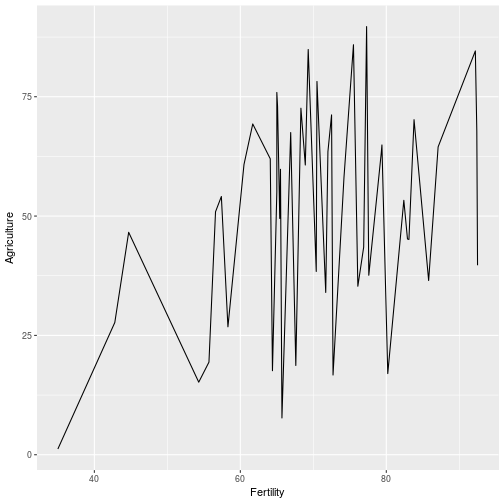
Scatterplot: Education by Examination
ggplot(swiss, aes(x = Education, y = Examination)) +
    geom_point()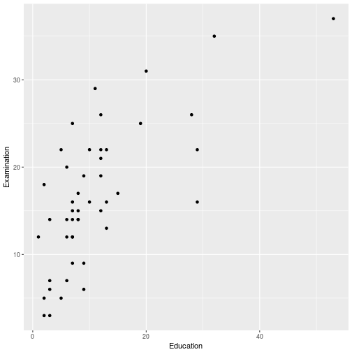
Scatterplot with regression/smoothing lin: Education by Examination
Using loess smoothing line:
ggplot(swiss, aes(x = Education, y = Examination)) +
    geom_point() +
    geom_smooth()
#> `geom_smooth()` using method = 'loess'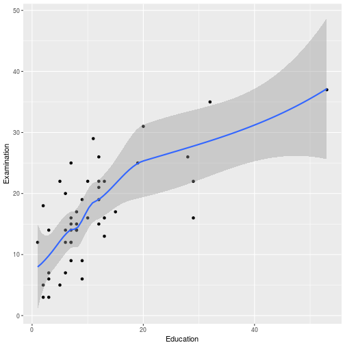
… or a simple linear regression line:
ggplot(swiss, aes(x = Education, y = Examination)) +
    geom_point() +
    geom_smooth(method = 'lm') # lm = linear model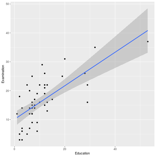
Barplot: Number of vehicle types (class)
ggplot(mpg, aes(x = class)) +
    geom_bar()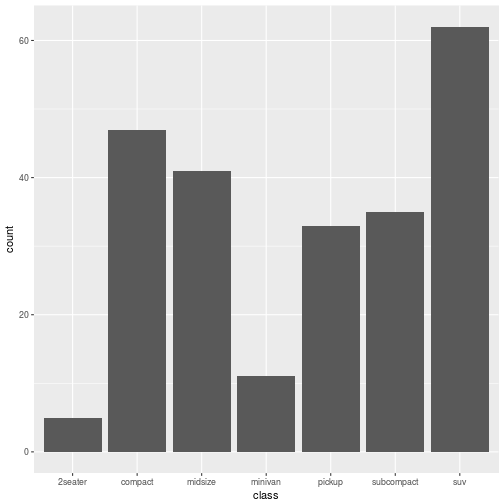
Boxplot: Vehicle type (class) by highway miles/gallon (hwy)
ggplot(mpg, aes(x = class, y = hwy)) +
    geom_boxplot()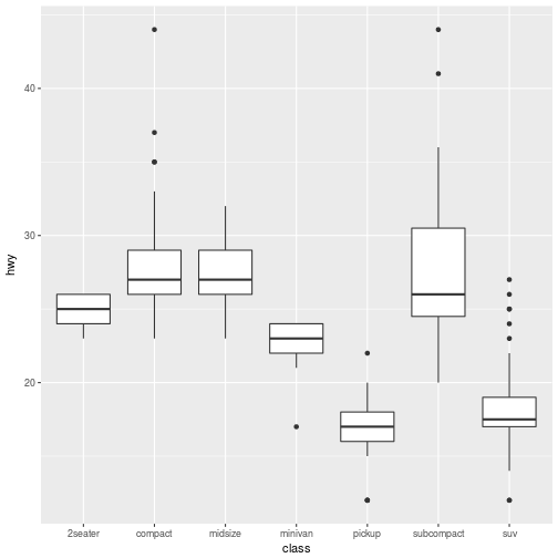
Sub-dividing up your plot:
Let’s plot drive type (4-wheel, front, rear) by highway mpg by number of cylinders.
ggplot(mpg, aes(x = drv, y = hwy)) +
    geom_boxplot() +
    facet_grid(~ cyl)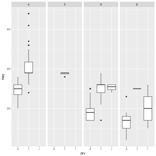
The ‘facet_grid()’ function specifies which variable to sub-divide by - in this case ‘cyl’. By coding (~ cyl), the figure will subdivide by columns, whereas if you coded it as (cyl ~), it will subdivide by rows.
There are dozens of types of layers (geom_) that you can use and the
documentation is incredible! So if there is a plot you want to make, you
definitely can do it in R!
Customizing your plots:
Default, using density plot (which shows the distribution of a continuous variable, useful for assessing skewness):
Note: fill tells ggplot2 how to fill in groups with a colour.
ggplot(mpg, aes(x = hwy, fill = drv)) +
    geom_density(alpha = 0.3) # alpha = transparency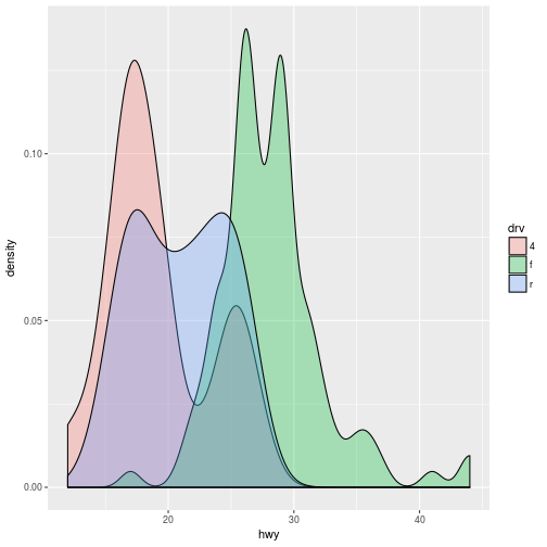
Adding a different colour (using the scale_ group of commands; since fill is
used, it would be scale_fill_ and since one of the colour palettes is called
brewer, it turns into scale_fill_brewer). You can see the different choices
for palettes by running ?scale_fill_brewer to look at the help file.
ggplot(mpg, aes(x = hwy, fill = drv)) +
    geom_density(alpha = 0.3) +
    scale_fill_brewer(palette = 'Dark2')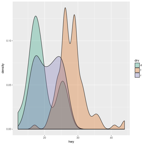
Similarly, you can use the scale_ function to make changes to the legend.
ggplot(mpg, aes(x = hwy, fill = drv)) +
    geom_density(alpha = 0.3) +
    scale_fill_brewer(palette = 'Dark2') +
      scale_fill_discrete(name = "drivetrain",
                      breaks = c("4", "f", "r"),
                      labels = c("Four wheel",
                                 "Front wheel",
                                 "Rear Wheel"))
#> Scale for 'fill' is already present. Adding another scale for 'fill',
#> which will replace the existing scale.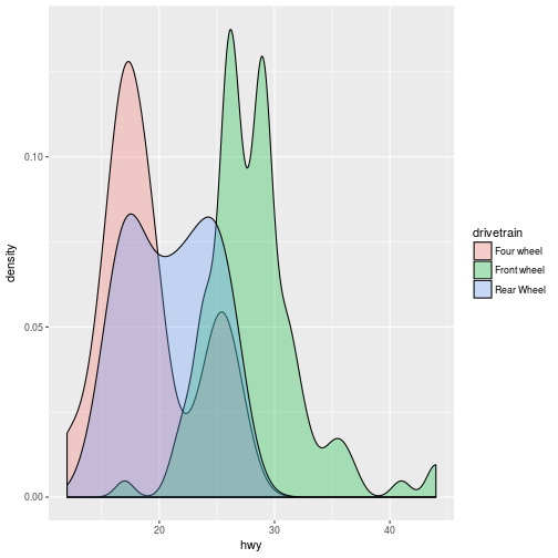
Using labs will allow you to modify or add titles to the figure.
ggplot(mpg, aes(x = hwy, fill = drv)) +
    geom_density(alpha = 0.3) +
    scale_fill_brewer(palette = 'Dark2') +
    ggplot(mpg, aes(x = hwy, fill = drv)) +
    geom_density(alpha = 0.3) +
    scale_fill_brewer(palette = 'Pastel1') +
      scale_fill_discrete(name = "drivetrain",
                      breaks = c("4", "f", "r"),
                      labels = c("Four wheel",
                                 "Front wheel",
                                 "Rear Wheel")) +
    labs(title = "Fuel Economy",
         x = "Engine Displacement",
         y = "Highway Mileage")
#> Error: Don't know how to add o to a plotAnd to customize individual features of the plot, you use theme. The theme
options are quite extensive, so if you want to look more into it, check out
?theme or the very detailed documentation
here. There is a nice
graphic right above “Complete and incomplete theme objects” section, near the
bottom of the web document.
ggplot(mpg, aes(x = hwy, fill = drv)) +
    geom_density(alpha = 0.3) +
    scale_fill_brewer(palette = 'Dark2') +
      scale_fill_discrete(name = "drivetrain",
                      breaks = c("4", "f", "r"),
                      labels = c("Four wheel",
                                 "Front wheel",
                                 "Rear Wheel")) +
        labs(title = "Fuel Economy",
             x = "Engine Displacement",
             y = "Highway Mileage") +
    theme(panel.border = element_blank(), # panel = background of the entire plot
          panel.background = element_blank(),
          panel.grid.major = element_line(colour = 'grey90'),
          legend.position = 'top',
          line = element_line(colour = 'black'),
          axis.line.y = element_line(colour = 'black'),
          axis.line.x = element_line(colour = 'black'))
#> Scale for 'fill' is already present. Adding another scale for 'fill',
#> which will replace the existing scale.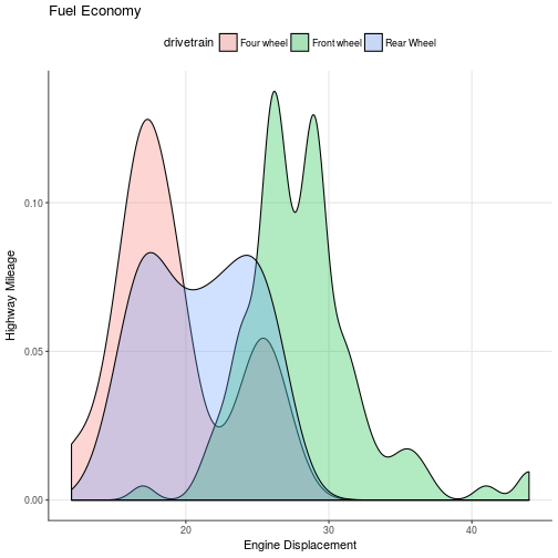
Another example:
ggplot(mpg, aes(displ, hwy)) +
  geom_point(aes(colour = drv)) +
  geom_smooth(method = "lm") +
  labs(title = "Fuel Economy",
       x = "Engine Displacement",
       y = "Highway Mileage") +
  theme_bw(base_family = "Times") +
  theme(title = element_text(size = 18),
        axis.title = element_text(size = 14),
        axis.text = element_text(size = 20)) +
  annotate("text", x = 6, y = 40, label = "p <0.05",
           size = 7)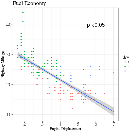
Finally, assign your figure code a name and save it as an individual file using ggsave.
ggsave("C:/Users/identify-the-path-you-want-to-save-in/nameyourfigure.png", nameoffigureyouassigned,
       device = "png", dpi = 600, width = 7, height = 8)
#> Error in grid.draw(plot): object 'nameoffigureyouassigned' not foundResources:
- ggplot2 cheatsheet (in RStudio ‘Help -> Cheatsheets -> Data Visualization’)
- ggplot2 documentation
- ggplot2 book
- Tutorial from a course
- DataCamp tutorials
- YouTube videos